Pull up a chair. I want to talk to you the way I’d talk to a friend who just showed me their new banner and asked, “What do you think?”
Scroll LinkedIn for two minutes and you’ll see it. The glowing brain. The robot holding a book. A sunset, a laptop, a coffee cup, three fonts, a gradient, and a headline in gold that says UNLOCK YOUR POTENTIAL. Every square inch is filled.
I won't put up any of the ones I've seen on LinkedIn, but this is sort of what I'm talking about.
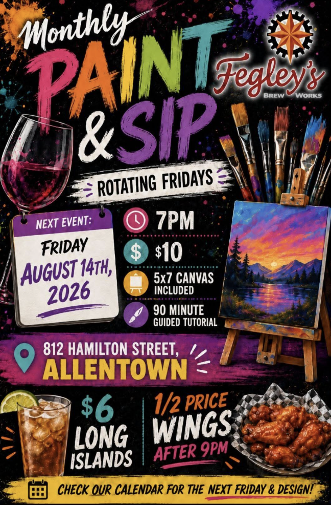
You’ve seen it. You might have made one. I’m not judging you. I’m telling you why it may not be working, or working against you.
Everyone has the same tools now. When you ask a tool for “a banner for an author,” it gives you the average of every banner it has ever seen. So when a thousand authors ask the same question, they get a thousand versions of the same answer.
And people’s eyes have learned that look. They recognize it before they read a word. So they skim. Your post gets scrolled past, and the effort you put into the writing never gets a chance.
The fix isn’t to quit AI. I use it every day, and some of these tools are awesome. The fix is to decide what your work looks like before you open any tool. That’s what a brand kit is. It’s a short set of decisions you make once, so every post, banner, flyer, and slide looks like it came from you.
Here’s how I’d build yours.
1. Start with your book cover Your cover already did a lot of the thinking. A designer chose those colors and that type on purpose. Pull from it. Your brand and your book should feel like they live in the same house.
2. Pick your colors and keep the list short Two main colors. One accent. One neutral for backgrounds and text. Write down the hex codes so you never eyeball it again. Slop uses every color at once. A brand uses the same few, over and over, until people recognize you before they see your name. Use a website like https://coolors.co/palettes/trending to help you choose the right pallet
3. Choose two fonts and stop there One for headlines, one for body text. When I see four fonts on one flyer, I know nobody made a decision. Your fonts are your handwriting. Keep them consistent.
4. Use real photos of you This is the big one. An AI headshot looks like an AI headshot, and people can tell. Book a real shoot and come home with 20 to 30 images: close up, wide, working, laughing, holding your book, in your space.
And don’t sleep on your phone. It’s already full of pictures of the world that inspires you, with flaws and real depth.
5. Give every graphic one job A banner is not a brochure. One message, one image, lots of empty space. Space tells people you’re confident. Clutter tells them you’re worried they’ll miss something. If you need to say five things, make five posts.
6. Write down your voice A brand kit isn’t only visual. Write down the words you use, the words you never use, and how you talk to people.
7. Build your templates once Take everything above and make three to five templates in Canva or whatever you use: a quote graphic, an announcement, a book promo, an event or podcast promo. Now you’re filling in your own templates instead of starting from a blank page every time. That’s where the real time savings live.
8. Then bring AI in as the assistant Once your kit exists, AI actually gets useful. Give it your colors, fonts, and voice rules, and it works inside your world instead of pulling you into its average. Let it help you draft, resize, and brainstorm. Don’t let it decide what you look like.
If these steps feel like a lot of effort, good, it should feel a bit hard to make those decisions because being intentional matters here. This is honestly how you can stand out.
My last piece of insight with this, if you have never designed a flyer before or designed much of anything, hand it over to a pro. Honestly spending money on YOUR brand and the look and feel of how people see you is so crucial. This stuff matters on every level, from your posts, to your LinkedIn banner to your landing pages.
Here’s what I keep coming back to. Making something is easy now. Making something people remember still takes taste, time, and the experience you bring to it. Good enough always yields the same mediocre result, and sameness is rarely memorable.
Your brand kit is how your taste shows up every single time, even on a tired Tuesday when you just need to get a post out.
If you want help building yours, reply here or send me a message. This is the work we do at Rising Authors every day.
Hussein